Todd@RUPES
Just a regular guy
A couple more 'simple' ones for Dave.


Follow along with the video below to see how to install our site as a web app on your home screen.
Note: This feature may not be available in some browsers.

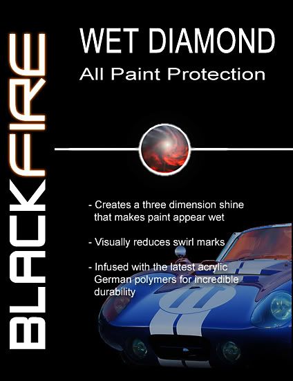
With out the car for you Dave
") . The problem with late model cars on a bottle or package is the car can become dated, or someone will have a negative opinion on a particular make and model and thus it does not have "universal appeal" ie: hurts sales.:2 cents: but then again what do I know.............
. The problem with late model cars on a bottle or package is the car can become dated, or someone will have a negative opinion on a particular make and model and thus it does not have "universal appeal" ie: hurts sales.:2 cents: but then again what do I know.............Normally I am with Dave on the no car in the label thinking, but "that car" is timeless especially as Ryan told me the one you guys did was real and not a kit car............. 6 in the world!!!! me likey
*******************^^^^^^^^^^^^^******************Thanks for the feed back...
I will work on some adjustments. I will likely need to move the Wet Diamond from the side to the top (left to right).
A couple more 'simple' ones for Dave.
A couple more 'simple' ones for Dave.