Navigation
Install the app
How to install the app on iOS
Follow along with the video below to see how to install our site as a web app on your home screen.
Note: This feature may not be available in some browsers.
More options
Style variation
You are using an out of date browser. It may not display this or other websites correctly.
You should upgrade or use an alternative browser.
You should upgrade or use an alternative browser.
Critique my business card!
- Thread starter 96 328ic
- Start date
Larrycolorglo
New member
Did you list all the services you offer on the back side?
LKDFW said:Did you list all the services you offer on the back side?
It will be a magnetic card.... there will be no back side. Im going to have a website by the time I have them printed so I will just put a link to that
HomicidalSloth
New member
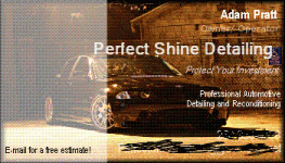
I don't like the "email for a free estimate" thing. I'd lose that personally. Other than that, I like it.
imported_Sludge1
New member
I think you have too many font sizes and styles on the card. More than 4 different sizes and styles per page is considered " busy". I like the background and the overall layout. Try fewer fonts, see how it looks.
Good luck
Good luck
HomicidalSloth said:I don't like the "email for a free estimate" thing. I'd lose that personally. Other than that, I like it.
I agree with the email suggestion and maybe use it to book appointments. Some people use emails for a planning reminder.
I like the back blank to write information, estimates, discounts and such for potential clients.
Cards are for direct sales IMO should be used in that regard. I don’t leave a card without a hand shake or a brief education on detailing.
Keeping to two fonts and styles is best, the Company name can be one and everything else another. Limit yourself to no more than three sizes.
Personally I don't like the opaque pane on the left along with the normal view on the right, it makes the card hard to read. Either stick to opaque for the whole card with dark lettering or the actual image with white like you have.
Personally I don't like the opaque pane on the left along with the normal view on the right, it makes the card hard to read. Either stick to opaque for the whole card with dark lettering or the actual image with white like you have.
imported_Sludge1
New member
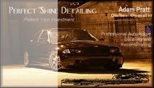
I think it looks much better with the second layout. I like the opaque pane because to me it signifies the change from blurry to sharp and shiny just like the cars you will detail. It also makes the card different, which is a plus. Nice work!
HomicidalSloth
New member
I like it. That last version looks very clean and pro in my opinion. Good work! 
AMDin93103
I like cheese.
I think if you flip the image horizontally you might be better off as your text will fall on the darker portion of the background. Also, can you PS out the handicap parking sign? Other than those to nit-picks, :up
M2C.
M2C.


